Category pages do not need more SEO theater. They need clearer structure, better copy, and fewer ways to get lost.
If you are trying to improve organic visibility for collections or category pages, the usual questions arrive fast: What should this page rank for? How much copy is enough before it becomes clutter? Which filters help shoppers without creating a maze of near-duplicate URLs? How do titles, headings, and product links work together instead of competing for attention?
Google’s SEO starter guide remains useful because it pulls the conversation back to basics: create pages that help people and make the structure understandable. Its guidance on title links and snippets points in the same direction. Search visibility usually improves when the page explains itself cleanly, not when someone tapes fifteen keywords to a filter panel and calls it strategy.
In this guide, I will walk through a practical checklist for category-page SEO: intent, unique copy, internal linking, faceted navigation, metadata, image handling, structured data, and ongoing maintenance. If you want the wider delivery context around store builds, our e-commerce experience page and digital marketing page are the natural companions.
Terms Worth Keeping Straight
Before changing templates or rewriting copy, define the basic parts of the page. This sounds small, but category-page work gets messy when the team uses the same word for three different things.
- Category page: A listing page that groups related products around a shopper intent, such as living room furniture, trail running shoes, or stainless cookware.
- Collection page: A merchandising variant of a category page, often organized around seasonality, use case, or editorial curation.
- Faceted navigation: Filters and sort controls that help visitors narrow a product set by attributes like price, size, color, or material.
- Thin page: A page with little original value beyond a product grid and boilerplate template elements.
- Internal link: A link that helps users and crawlers move from one useful page to another inside the same site.
- Structured data: Machine-readable markup that gives search engines clearer context about page type, products, breadcrumbs, and lists.
The useful mental model is simple: a category page is not just a shelf of products. It is a decision page. It should help a visitor understand what belongs here, how the range is organized, and where to go next.
1. Category Page Intent: What Visitors Expect to Find
Start with visitor intent before touching keyword tools. When someone lands on a category page, they usually want three things within a few seconds:
- Confirmation that the page matches what they searched for
- A quick sense of range, price level, or product types
- An easy path to narrow choices without starting over
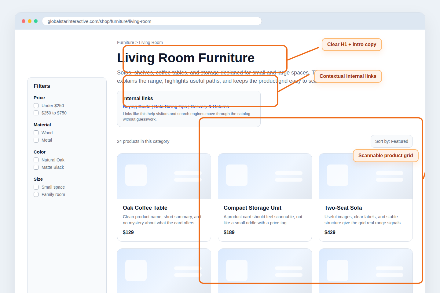
If the page is vague, the visitor has to do structural detective work. That rarely ends well. A category page for “living room furniture” should not feel like a warehouse dump where sofas, lamps, rugs, and storage units are all mixed together with equal importance. The interface should tell the story of the category.
I like to check intent with one plain question: if a shopper lands here from search, can they tell in under five seconds what the page sells and how to move forward? If the answer is no, the problem is usually not mystical. It is often one of these:
- The H1 is generic or mismatched with the product mix.
- The intro copy says almost nothing specific.
- The product grid opens with visually similar cards and no orientation.
- Filters exist, but the core range is not explained.
A practical fix is to make the top of the page do more work. Give the H1 a clear category name, add a short introductory paragraph that explains the range, and surface one or two next-step links that reflect real user decisions. “Shop sectional sofas,” “compare storage options,” or “read the small-space buying guide” are useful. “Click around and hope for the best” is less compelling as a conversion strategy.
2. Unique Content vs. Thin Pages: How to Add Value
Many category pages fail because they are assembled from the same template and a slightly different product query. Search engines are not impressed by that, and shoppers are even less impressed. Unique value does not require a wall of text, but it does require intent-specific content.
What usually counts as thin?
- An H1 plus a grid, with no explanation of product differences
- Boilerplate copy repeated across dozens of categories with only one noun swapped
- Collection pages created for every minor variation without a reason to exist
- Zero supporting links, FAQs, or buying guidance
What adds value instead?
- A short category intro written for the actual product range
- Subcategory links that reflect how people browse the assortment
- Buying guidance that resolves a real choice: size, fit, material, compatibility, seasonality
- Trust details when they matter: shipping windows, returns, availability, or usage notes
For example, a category page for trail running shoes has natural value points beyond “here are shoes.” It can clarify terrain types, cushioning levels, weather use cases, and fit considerations. A cookware collection can explain induction compatibility, material differences, and starter set logic. The goal is not to turn every category page into an essay. The goal is to give the page enough original context that it deserves to be found.
One useful constraint is to write a short intro that would still make sense if the product cards vanished for a moment. Could a visitor still understand what the category is for? If not, the copy is probably too generic.
3. Internal Linking Strategy: Products to Categories to Guides
Internal links are one of the cleaner ways to improve category-page usefulness because they help both discovery and navigation. I think of the structure as a simple operating system:
- Products link up to the right category.
- Categories link sideways to relevant subcategories or adjacent collections.
- Categories also link outward to guides, FAQs, or comparison content when the shopper needs context before choosing.
This is where many stores underbuild the middle layer. Product pages often exist. Blog guides sometimes exist. The category page, meanwhile, acts like a silent hallway with nice tiles. Better than nothing, but not by much.
A more useful category page usually includes a small block of contextual links near the top or just below the first product set. For example:
| Page type | Useful link target | Why it helps |
|---|---|---|
| Category page | Subcategories or top product types | Helps visitors narrow the range without relying only on filters |
| Category page | Buying guide or comparison guide | Supports shoppers who are still deciding what to choose |
| Product page | Parent category and adjacent options | Keeps navigation fluid when the current product is not the right fit |
There is also a content architecture point here. Guides should not float around disconnected from the commercial pages they are supposed to support. If you publish an excellent size guide but never link it from the relevant category, it becomes a side quest. The page has value, but the workflow is broken.
That same thinking is part of good site planning more broadly. If you want the strategic context behind how structure, merchandising, and content fit together, the overview on our home page and the store-planning examples on our e-commerce page make the larger pattern clearer.
4. Faceted Navigation Basics: Preventing Index Bloat
Filters are useful for shoppers and dangerous for information architecture when left unmanaged. The goal is not to remove faceted navigation. The goal is to stop every filter combination from pretending it is a strategic landing page.
A healthy rule of thumb is this: keep filters easy for users, but be selective about which filtered states deserve to stand as search-entry pages.
At a high level, watch for these risks:
- Near-duplicate pages created by color, size, sort order, or minor attribute combinations
- Thin filtered states with almost no products or no unique context
- URLs that multiply faster than the merchandising team can maintain them
- Filter combinations that make sense for browsing but not as standalone destinations
The non-technical fix starts with judgment. Ask which category or filtered pages represent genuine search demand and clear shopping intent. A page for “men’s waterproof hiking jackets” may deserve focused treatment. A page for “jackets sorted by highest price with blue and green checked at the same time” probably does not need its own SEO ambitions.
Faceted navigation works best when the store distinguishes between utility states and destination pages. Utility states help people browse. Destination pages deserve unique titles, supporting copy, curated product mixes, and maintenance. If everything becomes a destination, nothing is curated, and the catalog starts behaving like a spreadsheet with branding.
5. Metadata Checklist: Titles, Descriptions, and Headings
Metadata should help the page describe itself consistently across search results and on-page structure. This is less glamorous than debating “content hubs,” but it matters more often.
Use this working checklist:
| Element | What good looks like | Example |
|---|---|---|
| Title tag | Specific, readable, aligned with intent | Living Room Furniture: Sofas, Tables and Storage |
| Meta description | Summarizes range and a useful differentiator | Browse living room furniture including sofas, coffee tables, shelving and compact storage solutions for modern spaces. |
| H1 | Clear category name that matches the page content | Living Room Furniture |
| Subheadings | Used to organize help content, FAQs, or featured ranges | How to Choose the Right Sofa Size |
Three mistakes show up constantly:
- Title tags that read like a grocery list. Adding every keyword variant into one title usually weakens clarity.
- Descriptions that restate nothing useful. “Shop our collection now” is not harmful, just forgettable.
- Heading structures that drift. The page says one thing in the title tag, something looser in the H1, and then offers no meaningful subheadings at all.
I prefer to write metadata after the core page structure is settled. That keeps the title, description, H1, intro copy, and product mix aligned. If you write metadata first and improvise the page later, the pieces tend to drift apart. Search engines notice that eventually. Shoppers notice it immediately.
6. Image SEO: Alt Text and Descriptive Filenames
Image optimization on category pages is partly about discoverability and largely about clarity and performance. Google’s guidance for images in Search is still the cleanest reminder: use helpful filenames, useful alt text, and page context that explains what the image represents.
For category pages, the practical rules are straightforward:
- Name files descriptively, such as
living-room-wood-coffee-table.jpg, notIMG_4837-final-v2.jpg. - Write alt text that describes the product or image function, not a stuffed keyword chant.
- Keep image dimensions sensible so the grid loads quickly and predictably.
- Use consistent crops so the listing feels intentional rather than improvised.
Good alt text often sounds boring in the best way. “Oak coffee table with lower shelf” is useful. “Best living room furniture coffee table sale online cheap” is not. The first helps a human understand the asset. The second sounds like a machine having a stressful afternoon.
Also remember that category-page images inherit meaning from surrounding context. A product photo inside a clearly named category, with descriptive product text and a stable page structure, gives search engines more to work with than the image filename alone.
7. Schema Considerations at a High Level
Structured data will not rescue a weak category page, but it can make a strong page easier to interpret. Keep this section high level and useful. The goal is clarity, not markup cosplay.
For commerce category pages, the most relevant schema concepts are usually:
- Breadcrumbs: to show the page’s position inside the catalog hierarchy
- Item lists: to represent a structured list of products or category entries
- Product details: usually more appropriate on individual product pages than on broad category pages
The Schema.org ItemList reference is a useful starting point for understanding how lists are described. What matters in practice is that the structured data matches the visible page. If the category shows a breadcrumb path, a named category, and a product list, the markup should reflect that same reality. Do not create a second fictional version of the page in code.
This is also where moderation helps. Not every category page needs an elaborate structured-data experiment. Get the visible information architecture right first. Then make the machine-readable layer reflect the page honestly.
8. Ongoing Maintenance: Seasonal Updates and Content Refresh
Category SEO is not a one-time launch task. Collections change, inventory changes, and search intent shifts with seasons, promotions, and product strategy. If the page never gets reviewed, the copy becomes decorative while the catalog moves on.
A sensible maintenance rhythm looks like this:
- Monthly: review top category pages for out-of-stock clutter, weak internal links, and stale intros.
- Quarterly: compare titles, descriptions, headings, and product mix against current demand and merchandising priorities.
- Seasonally: refresh collection copy, featured subcategory links, and supporting guides when shopper priorities change.
- After major catalog updates: check whether new ranges deserve new destination pages or whether existing pages need clearer segmentation.
Seasonal maintenance is especially useful for fashion, gifting, outdoor products, homeware, and other categories where demand patterns shift with timing and context. A collection page built for spring launches should not still read like the season never ended. The internet remembers old copy longer than it should, so it helps when the site itself remembers to update it.
Maintenance should also connect to broader marketing workflows. If campaign priorities change but category pages stay frozen, paid and organic efforts start pulling in different directions. That is one reason category-page review belongs inside a wider digital marketing process rather than living only in an SEO checklist document.
A Practical Before-and-After Example
Imagine a category page called “Storage.” Before cleanup, it has a vague H1, thirty products, two repeated template paragraphs, and filter combinations that generate endless thin states. After cleanup, the same page might look like this:
- Before: H1 says “Storage,” intro says almost nothing, and product cards dominate the page without guidance.
- After: H1 becomes “Bedroom Storage and Closet Organization,” the intro explains the range, and links point to wardrobe systems, under-bed storage, and small-space buying advice.
- Before: all filter states are treated equally.
- After: the team identifies a few real destination themes and treats the rest as browsing utilities.
- Before: titles, headings, and descriptions feel disconnected.
- After: metadata, page copy, and merchandising all describe the same commercial intent.
That kind of change rarely looks dramatic in a status meeting, but it usually creates a better page for everyone involved. Better pages earn better engagement signals, stronger linking opportunities, and cleaner long-term maintenance. That is the unglamorous part of SEO that tends to keep working after trend decks have moved on.
Final Checklist for Category and Collection Pages
Before publishing or refreshing a category page, make sure you can answer yes to these questions:
- Does the page immediately match a clear visitor intent?
- Is the intro copy specific to this category rather than copied from a template?
- Are internal links helping visitors move to subcategories, products, or guides?
- Are filters supporting browsing without multiplying thin destination pages?
- Do the title tag, meta description, H1, and visible copy all align?
- Are image filenames, alt text, and grid presentation handled cleanly?
- Does any structured data reflect the visible page honestly?
- Is there a maintenance plan for seasonal updates and range changes?
A strong category page behaves like a well-designed interface, not a keyword bucket. It helps the right visitor understand the range, narrow choices, and move deeper into the store without friction. If that operating system feels loose today, start with one high-value category, tighten the structure, and review the results before scaling the pattern across the catalog.
If you need help turning category-page cleanup into a broader store architecture review, start with the e-commerce section, explore the bigger site picture from the GlobalStar home page, or use the contact path from the broader site when the issue needs implementation rather than another spreadsheet.